Thursday 27 May 2010

FIN ~


Finishing Line...


It's in sight!
This extra day has been a god send. Not that I wouldn't have finished in time, but it's nice to not have to rush so much.
Anyway, I went out and bought another notice board as I used both of the ones I bought before for posters. This middle one is for the little odd bits and bobs of things that you might (or might not) expect to be on a notice board.


After much rearranging to see which looks the best I have settled on a pretty messy approach but everything is carefully evenly spaced (in that there isn't two of the same print next to each other)

Here are some photos of the finished installation which has been temporarily installed in my front room. This is a rough idea of what it will look like in the exhibition:


Wednesday 26 May 2010

Everything In It's Right Place


So.. according to the list of everything I should have in the room, I've got everything I need to start arranging the contents on the desk!

- Desk
-Typewriter
- Note left in typewriter
- Mirrors
-Pack of Cards
-Dice
-Keys with labels
- Notice board
- Poster(s)
-Notice (Be back 5 mins ago)
- Letter and Envelope
- Jars with quotes x 4
- Information cards

- Polaroid of finished room (Can't have this one till I actually finish the room...obviously)

I've been playing around with different positions for things on the desk:

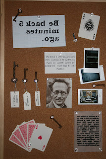
The positioning of all the information on the table will be fairly random and scattered I think.

I was initially just going to have 1 poster on one notice board but I think I quite like the effect of two. I was going to have odd bits like the keys and the notices and other bits and bobs pinned onto the other. But I might go out and buy another and that one can go in the middle of the two posters.

I have also decided to scrap the shelf too and have mirrors on the other wall as well. This will create a really interesting multiplying effect when the viewer looks in the mirror meaning that the information and the viewer will be in many different places at once, physically demonstrating the concept of quantum superposition.

Tuesday 25 May 2010

Screenprinting: The Final


Combinations of colour and paper used:

- Black on white paper
- White on black paper
- Black on graph paper
-White on grey paper
-Black on tracing paper

Today was my last day of screen printing, and it didn't go too well...
I was screen printing the information cards that will be lying around on the desk on different types of paper and colours, but it seems the letters were a little too small and more often than not, the result was messy. In some cases it worked to the advantage of the vintage feel of the installation, but in others it was just a disaster!


Sometimes there was simply too much ink for the size of the letters (a fault on my part) but the size of the things I wanted to print just made it very difficult. Sometimes the squeegee didn't reach all the letters leaving the image only half printed. All but one small section of the tracing paper prints were ruined and the paragraph about Superposition didn't come out right in any of the combinations! So I'll just have to print that one out using the computer as there is no opportunity to try and screen print it again...

All in all it was a tricky one.
But I managed to pull out some nice enough looking ones for the final installation:

They're not pristine looking prints but I really quite like that and I think it's appropriate to use them.


Here's a look at them in action:

Monday 24 May 2010

Screenprinting: THE FINAL POSTER


I did the final prints for the shortlisted combinations of colour and paper:

-Black on white paper
-Black on off-white sugar paper
-White on black paper
-White on off-white sugar paper
(The shop didn't have any sugar paper so it ended up being mostly grey paper; had one A3 sheet of sugar paper left!)


Out of all the screen prints I shortlisted 6 and then whittled it down to these 3:
(Black on grey, black on off-white, white on black)
These three were the clearest, most effective/dramatic and most aesthetically pleasing. They all look quite bold, and I like how the white ink on the black isn't consistent; it has a murky, mysterious quality to it.


I decided to go with the grey/white with the black/white.

I will be doing the final screenprints of the information cards. I learnt from my InDesign attempts that I should just keep them looking simple; the Quantum Superposition card was simple and I think it looked far more effective than the other two overambitious designs!


I kept the designs as simple as possible, trying to keep them quite like the Quantum Mechanics paragraph contained in the two boxes. I didn't think they necessarily needed to make a statement so the one about parallel universes is a really simple paragraph of writing in the middle of the page. The other 3 however do say a little about what's in the paragraph. I love the one about the 'World Line' and how it snakes down the page. The paragraph about Quantum Entanglement uses the same design as the Quantum Mechanics one; it's neat and effective and shows the information being communicated over two places at once.

Sunday 23 May 2010

Envelopes and Noticeboard Experiments


I decided instead of just using an envelope I would make one myself. This proved easier said than done.

I initially attempted to make one free hand; it looked easy enough. It came out looking just a little rough around the edges:
Not too bad, it just actually looks like I've sat down and made it from scratch, which is not the look I was going for...

I thought it would probably be useful to get a couple of existing envelopes and open them up so I could use them as templates.

So I drew around the template and produced an envelope of my own!


Now all there is to do is experiment with the different kinds of paper I could use for it and see which one looks the best.

I thought the most suitable colour was the bottom one; it was the closest colour to the original envelope and looks the most authentic. I got some good quality card from the college shop so the envelope is nice and sturdy and has a lovely texture.

I thought the best way to see what combination was most suitable for the poster was to test it in action! I put all the different combinations of colour and paper on the notice board to see which one looked the most aesthetically pleasing:


The graph paper was not a good enough quality to be used for the poster and the red, as beautiful and striking as it is, clashed with the brown of the notice board and desk. The black, white combinations worked the best so these will be the combinations I use when screen printing the final poster. In terms of the 'Be back 5 mins ago' notice, the paper that looked the best was either the white or the graph paper with black ink as, again, the red clashes.

I couldn't find a notice board large enough so I put the two together to create the illusion of a larger one! I put the poster right in the middle across the two for maximum impact as the poster will be the first thing the audience will see. However it made it awkward to pin up the notices. I think it would be best if the poster occupied one, and the notices and keys etc. occupied the other.