Sunday, 23 May 2010

Envelopes and Noticeboard Experiments


I decided instead of just using an envelope I would make one myself. This proved easier said than done.

I initially attempted to make one free hand; it looked easy enough. It came out looking just a little rough around the edges:
Not too bad, it just actually looks like I've sat down and made it from scratch, which is not the look I was going for...

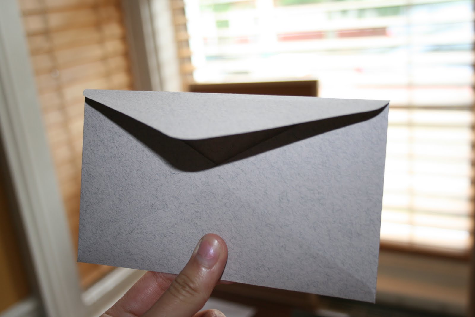
I thought it would probably be useful to get a couple of existing envelopes and open them up so I could use them as templates.

So I drew around the template and produced an envelope of my own!


Now all there is to do is experiment with the different kinds of paper I could use for it and see which one looks the best.
I thought the most suitable colour was the bottom one; it was the closest colour to the original envelope and looks the most authentic. I got some good quality card from the college shop so the envelope is nice and sturdy and has a lovely texture.

I thought the best way to see what combination was most suitable for the poster was to test it in action! I put all the different combinations of colour and paper on the notice board to see which one looked the most aesthetically pleasing:


The graph paper was not a good enough quality to be used for the poster and the red, as beautiful and striking as it is, clashed with the brown of the notice board and desk. The black, white combinations worked the best so these will be the combinations I use when screen printing the final poster. In terms of the 'Be back 5 mins ago' notice, the paper that looked the best was either the white or the graph paper with black ink as, again, the red clashes.

I couldn't find a notice board large enough so I put the two together to create the illusion of a larger one! I put the poster right in the middle across the two for maximum impact as the poster will be the first thing the audience will see. However it made it awkward to pin up the notices. I think it would be best if the poster occupied one, and the notices and keys etc. occupied the other.

Saturday, 22 May 2010

Letter Experiments


At the moment I am working on producing the final letter and envelope. I have typewritten the letter onto 4 different kinds of paper to see which one looked best and then scanned them in and reversed them:

(Newsprint)

(Brown paper)
(Lined)
(Squared)

The scans lost a lot of the texture and authenticity of the originals and when I printed them out they came out quite fuzzy and lacking colour, thus actually looking like scans which is NOT what I wanted. I tried to photocopy the letter but that gave an even worse effect:

As it was printed straight onto the flimsy photocopy paper it just didn't have a nice feel to it, and the background was grainy.
After that, I remembered that Rob had mentioned that I could download a typewriter font from the internet and reverse that with the printer.

I found a few and tried them out. The top two were inappropriate for the look I was going for but I decided to experiment with the last two which looked quite like my actual typewriter font. This is a great method for producing the letter as I can print the letter onto any paper I want, it is much less time consuming than using the actual typewriter, and to reverse it all I have to do is select 'Mirror Image' in the print options.

They both looked quite good, however I felt that this bottom image was the best font. It looked most like an authentic typewriter font. The top one was almost too clean, whereas the other one retained some of the idiosyncrasies that kept it looking more genuine. I printed this onto newsprint as it gave a much nicer quality than printing straight onto plain white paper.

The colour I had been printing them out in was a very dark blue as my typewriter ribbon has a slightly blue tinge to it. However I decided to try it out in automatic black as well just to see how it came out.

I felt the effect of the black was a little overwhelming and realised that my typewriter didn't appear to make marks as dark as this looked, so I think it's best if I stick with the dark blue.

Now that I've figured the letter out, the text in the jars should be easy to do!


I can use the same method for the key labels too:


Friday, 21 May 2010

DESK


I finally bagged myself a desk! Well, it's actually just a table, but it'll do as a desk; there's not enough time left to be picky! Got it from an old and used furniture shop just around the corner from my house which was handy. I've just got an issue of actually getting it into college now. Apparently it won't fit in my dad's car...

I've also borrowed an old pack of cards that I'm going to have on the desk, face down, as an allusion to the film I made earlier in the year. Maybe I'll throw some dice in there too.

I've got a long list of things to do this weekend. It's going to be a busy one...

Thursday, 20 May 2010

Screenprinting (Poster)


Today I was just screen printing the poster. I printed it in black, red and white (on black). Although I absolutely loved the colour itself, I decided not to try it in blue as I just thought it didn't really suit the whole installation and the vintage feel I am trying to create.

The use of the black ink does give the poster a much more vintage and dramatic feel. It is really bold and almost looks like newsprint, especially when printed onto the off white sugar paper (Only 20p a sheet and it gives my prints a lovely atmosphere compared to the bright white card!)

I think the red is really beautifully striking although I will have to experiment with whether or not it suits when it is pinned to the notice board. It is possible that the red could clash quite unattractively with the brown of the cork... I also think the use of graph paper overall is a little too casual for the poster. If I want this poster to be making a statement then it needs to be on nice, good quality paper. Failing that, the paper at least needs to have a nice texture; even the slightly off white sugar paper looked quite good when printed on to.

It was quite frustrating today as the photocopy I gave to Brian must have had some invisible noise or something on it because the screen came out really speckled, particularly around the "you" making the prints look shoddily produced. Although I guess in a way the extra noise gave the prints a bit more authenticity and a sort of textured feel to the print, I can't help but feel it would look a little shabby if the final poster was so speckly! This weekend I will work on producing a photocopy doesn't have as much noise in the background and hopefully this will produce a much cleaner print.

Tuesday, 18 May 2010

Screenprinting


So, today was my first attempt at screenprinting...
I had no idea it was so messy! Or that it involved so much washing and drying and waiting... But I'm quite pleased with some of the results and managed to experiment with quite a few combinations of color + paper + text. It was a little daunting at first, but once I got the hang of it, it was pretty easy.


This is a print on tracing paper. I don't think it would be a good idea to print the poster onto it as it didn't seem to take the ink very well. The smaller pieces of text were okay, but the paper on the left hand side seemed to crinkle under the weight of the ink. That may have been an error on my part, as it was one of the first prints I did but I wasn't too impressed by it anyway.

I really love the black on brown paper, however I think the graph paper could make a really nice contrast with the notice board. The brown paper might blend into the cork of the notice board and I want this to be a noticeable standalone..notice!
(Clearly still getting to grips with the printing...printed half of the image onto the table!)

I think this blue colour is gorgeous...I'm just not sure that it's the right colour for the office...
The smaller writing was quite nice in the blue but I definitely don't think the notice "Be back 5 mins ago." should be in this colour. It just doesn't really work. I also don't think the colour is bold enough for the poster. The poster makes such a bold typographical statement, it would be a shame to lose it in a colour that can't pull it off.

I really like those black and white prints (the one that came out properly anyway!) I also really like the white on sugar paper too. It's a very unusual combination but I think it looks quite charming. Whether or not it is the right combination to use for the poster is another story, but I'll see when I start photographing my experiments on the notice board itself.
The red ink on black paper on the other hand, was a FAIL.
The red came out too dark and the poster was essentially even more illegible than it already is.

Monday, 17 May 2010

Typography


Today I was experimenting with the layout of the information that will be around the room, poorly attempted with InDesign! :

I wanted to shape the text to imitate something mentioned in the text. The first piece of text uses the example of two open windows so I tried to demonstrate the image of the two windows using two blocks of text. I quite like the simplicity of the top image in comparison to the other two which are quite busy and already hard to read as they are reversed. The second image tries to demonstrate the idea of a link between two particles, using some of the words to make up the link. It reminds me a lot of Alan Kitching's 'Thames' with the words following the words of the river:

I like the concept, but I think it's quite shoddily executed (lack of InDesign skill!) In the final experiment I used some images to visualise the idea of parallel universes. It doesn't look so bad when it's scanned in and scaled down, but I felt in real life it actually looked quite crass!

The information is research I have gathered and put into my own words to make it easier to understand. I felt that it would be much more appropriate to have the information told simply rather than regurgitated from a text book.


Screenprinting:
This is the template I am using for experimenting with screen printing tomorrow. It's got a bit of everything in it; the poster, the information text and the notice so I'll just have to see how that goes. (Fingers crossed)

Saturday, 15 May 2010

Time's Running Out!


Things to do:

- Experiment with screen printing to see if it is an appropriate method of production
-Finish poster layout
- Configure layout for information signs
- Find a way to have words typewritten backwards (download font or photocopy?)
- Reverse key labels using computer
- Find a desk!
- Sort out measurements for and find 2 panels of wood for the walls