Thursday, 13 May 2010

Typography Poster (Reversing)


I did some photocopy experiments today to see what the tests looked like when reversed:


(This one annoys me so much!)


I think they all look pretty good reversed, well... interesting rather than good. I think because when it's reversed it obviously becomes illegible, so some of the things that made an experiment hard to read or not look right seems to be cancelled out by the mirror image as we are not really trying to read it. I still think the top one looks best though. I like how symmetrical it is and it fills up the whole space nicely and still looks really interesting when reversed.

I spoke to Rob (other one) about my project for the first time and he mentioned the clever idea of having handheld mirrors lying around the installation, like on the desk, for those of us (me included) whose eyes are not what they used to be. I think it would be a nice touch, and quite handy for those little bits of text in the jars for example, if anyone actually bothers to read them.

I am also going to screen print next week to see if I can find an appropriate way to create all my text reversed without it looking photocopied. I also spoke to James in letterpress and he said that I could also get some polymer plate/stencil things done for me in etching and then I can use them to print them down in letterpress. Only thing is, it sounded like it would cost a lot of time and money, neither of which I have a lot of at the moment, so I'm keeping my fingers crossed for screen printing...

Wednesday, 12 May 2010

Typography Poster (Experimenting)


I have been experimenting with the typography for the poster that will be on the notice board. I want to try and get the idea of something being in 2 places at once through the typography.

Here I am experimenting with the letters existing in two words at once.
It reminds me a little of a periodic table!

I quite like the concept, although I think it's very hard to read, especially if you didn't already know what it said, and also as it will be reversed!

As the image is going to be reversed I would like them to be just typography and ideally keep them as simple as possible. Here are some more experiments:

I like the enjambment of the letters in this so that it flows down the page. It seems to suggest two things either side of the page forcing the letters down onto the next line. I'm not too sure about the "two" though...

I'm not too sure what I think of this one. I quite like the blank space in the middle (kind of relates to the idea that atoms mostly consist of just vacuum, although very irrelevant...). The asymmetry of this drives me insane and I think I would obsess over it too much. I don't think this makes too much of a statement.

The idea was to have the words running across two posters so the information is in two places at once. I hate how this turned out though. I quite like the concept, but I feel this is very poorly realised...

I like the good old block typography feel of this poster. It's quite bold and looks like it is making a statement. Only problem is that it could be quite confusing to read, especially if reversed? It may still look interesting once reversed though, regardless of legibility.


I do like the look of these ones, although I don't know what their compositions say about quantum theory or the idea of something being in two places at once...? I guess I need to work out whether that's really necessary.

This one I love!
It's bold and incorporates the use enjambment. I really prefer the focus on the word "atom" rather than "two" as I had done with the others. It kind of says, if the word "atom" can be repeated and be in two places at once, why can't the word "you"? I think this has been the most successful out of all the experiments.


Tuesday, 11 May 2010

Fully Reflected

After a chat with Rob I have decided that all of the things in the room need to be reflected rather than just some pieces. I couldn't justify only some things being reversed so if everything is reversed, it will literally be another world and you can peer into the other world that's the right way round through the mirror on the wall. That way, whatever you do to one, will immediately and inevitably affect the other, much like in Quantum Entanglement. It basically just makes a bigger statement than if just bits of it were back to front. The only the problem now is, how do I create the text back to front? I've done it with photocopying but it doesn't give a very polished finish; photocopies...? And I can't do it back to front with letterpress as the letters are already reversed! And with the typewriter, well I'm pretty sure it would be impossible to type it back to front.


On the topic of the whole room being back to front, I looked at Alice Through the looking Glass which was very relevant to what I want to achieve:

"Alice is playing with her kittens — a black kitten and a white kitten, the offspring of Dinah, Alice's cat in the first book — when she ponders what the world is like on the other side of a mirror's reflection. Climbing up on the fireplace mantel, she pokes at the wall-hung mirror behind the fireplace and discovers, to her surprise, that she is able to step through it to an alternative world. In this reflected version of her own house, she finds a book with looking-glass poetry, "Jabberwocky", whose reversed printing she can read only by holding it up to a mirror."

-Wikipedia


---|---

I've also come up with a new main poster slogan:

"If an atom can be in two places at once, why can't you?"

I think, 'Be Back 5 Mins Ago." gives the impression that the installation is about time travel. Whilst it is about time travel in a sense, that is not what I am really trying to communicate. I am trying to communicate the idea of something being in 2 places at once, so I think this phrase is more appropriate for a poster that will be the first thing the viewer sees, and will highlight my intention of rendering the information AND the viewer in two places at one time.

Thursday, 6 May 2010

Key arrival!


I bid for some old keys on ebay and got them in the post today! It's amazing what people are willing to spend on a bunch of old keys...some auctions got up to over £10, just for a collection of dirty old keys!? Whatever floats your boat...
I got mine at a cheap and cheerful £1.50 for 9, not sure why they weren't as sought after as the others but they weren't.


I would like the keys to have subtle references to the subject matter of the installation. E.g. A tag on the key that says "Schrodinger's Box"... "Einstein's Office"..."TIME MACHINE"...etc... so I created some tags for them inspired by the "Eat Me" and "Drink Me" labels from Alice in Wonderland:

They're really simple but I quite like that. I might try using a different kind of string to attach them as that grey one keeps fraying and doesn't really look right. I'd like to have them hanging up somewhere not very noticeable but still in view just as a really subtle reference.

I think they'd look great on the notice boards I bought from IKEA to go above the desk.


I also experimented with reversing the letterpress I did using a photocopier and choosing the mirror image option. Here are some examples:


I do really like these photocopies, I think they give a really nice feel but are perhaps not polished enough to be used in the final installation. Maybe I will have to use screen-printing?

Letterpress Results


Here are some photos of the printed results of letterpress:

I was quite happy with the results and especially liked the quote printed onto the tracing paper, I think it looks really effective, quite clean and scientific, and would like to use it somewhere in the final piece. The brown paper didn't do it any favours though; I think because the font is so thin and takes up such little ink on the page, the brown almost swallows it up a little bit. However, I like the effect of the print on the brown paper for the "Be Back 5 Minutes Ago." but think it looks better just on the white background. The print on the tracing paper for that one didn't come out so well, it was much more successful with the quote.

After a quick chat with Noel, my head has been sorted and I have a long list of things to be getting on with:
  1. GO OUT AND BUY A DESK AND START EXPERIMENTING!
  2. Go and speak to Neil in 3D and get some help with how I'm going to construct the walls of the office.
  3. Write a list of every single thing that is going into the installation.
  4. Make a hierarchy of this list, from the most important/visible to the least important/visible.
  5. From this, decide what format I want each piece of information to be i.e. poster, letter...
  6. Gather all the text that I want to be used in the installation.

I've decided that I would quite like to make the phrase "Be back 5 minutes ago." into a poster, making it the first thing that the audience see. I have also decided that I don't want there to be two rooms anymore. Seeing as I am using a mirror, a mirror effectively does what I wanted the additional room to do: render the information and the audience in 2 places at once.

Tuesday, 4 May 2010

LETTERPRESS


Argh, letterpress. The bane of my life. I had completely forgotten how painstaking it can be (especially when you do it wrong....). I had done it before but was just trying it out in the aesthetics of my project. I don't have the final product as I haven't actually printed it yet due to a ridiculously long waiting line to use the press...

I am going to letterpress two phrases, one that says:
"Be back 5 minutes ago."
as a notice left in the time traveller's office.

And a quote from Daniel Greenberger:
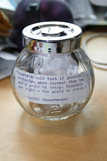
"Einstein said that if Quantum Mechanics were correct then the world would be crazy. Einstein was right - the world is crazy."
to demonstrate the absurdity of the theory.

Here are some photos of the letters all in place and ready to be printed!

(Excuse the bad quality, they're taken on my hundred year old camera phone)

I had a tutorial today, and whilst it unfortunately wasn't hugely helpful, it got me thinking about other ways to communicate the idea to an audience. John and I spoke about making it a bit more playful, and maybe having the time traveller change history. I wanted to have old physics and history books scattered around the place so maybe I could have the pages changed slightly to alter history? We also spoke about using photographs as proof of time travel e.g. having a polaroid of someone from the past to prove that the time traveller had actually travelled backwards in time.

I'm also having a lot of trouble with figuring out how the actual installation itself is going to be built as I would like a mirror on one side, and a shelf on the other... things are starting to get frustrating...

Saturday, 1 May 2010

Jar Experiments


I've been experimenting with some jars I picked up from IKEA last week. As I was still on the idea of the room being Schrodinger's office, I wanted to have scientific jars scattered around the room. Despite changing the idea to a time traveller's office, I decided to experiment with the jars anyway and these are the results:

I really like this effect. The look I was going for was the idea of scientific experiments kept in jars which is quite a dated tradition, but the design of the jars brings it more up to date creating a contrast between the typewritten notes inside and the futuristic glass of the jar containing it.